
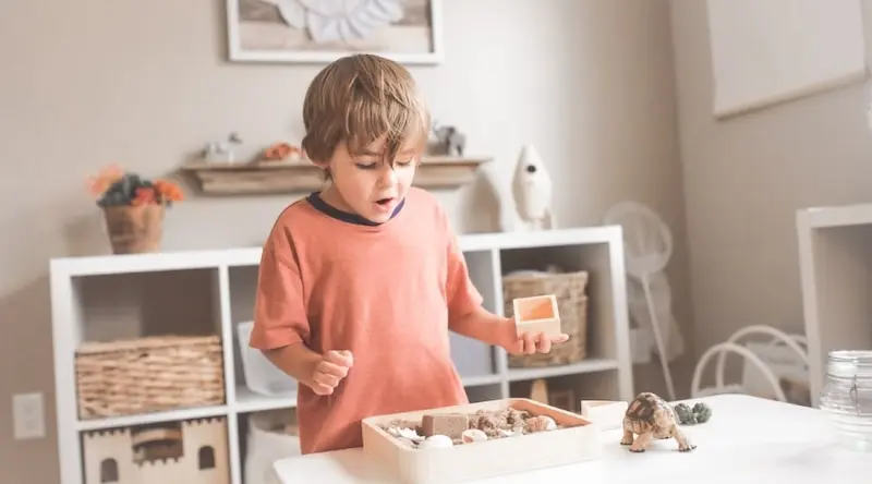
Seeing a child in purple welly boots, a lime green jumper, scarlet trousers and a neon yellow hat is probably a daily occurrence for you. Sometimes children dress like a paint factory explosion. But is that their own choice, or because adults think they love it?
In the Early Years, we can go a bit overboard with colour. From wall displays to paintings covering windows, we love to make everything as bright and cheery as possible. But have you ever stopped and asked yourself...why?
Before you gasp in horror, there’s nothing wrong with colour. It’s a basic ingredient in our world, our lives and our language. When we’re angry, we see red. If another child’s got some brand-new trainers, we might go green with envy. If it’s raining outside, we might feel a little blue.
It’s the way we’re using it in Early Years settings that’s the issue.
We’ve written about why light makes a massive difference to children’s ability to learn, and it turns out colour is no different. Having a rainbow of colours over your walls may be a feast for the eyes, but it’s incredibly overwhelming and can significantly distract children from their play or learning experience.
This article aims to plant a little thought, and ask if we should be questioning our colour-fantastic Early Years settings for something a little different, and a little more calming.
And, more importantly, it asks how we can put the children back at the centre of our environments. From asking the children how they feel about colours in the space to giving them a say on what goes on our boards - they should be a part of the decision.

Overstimulated children
From the minute they wake up, children rush from activity to activity: brushing their teeth, frantically having their hair combed, hurriedly scoffing some cornflakes and then rushing out to their setting. Like adults, they lead fast-paced lives.
Stephanie Bennett, co-founder of The Curiosity Approach, explains that combining these little stresses with a fluorescent rainbow classroom might be like mixing baking soda and vinegar.
“This sensory overload causes children to store up that stress. And we’re then bombarding our early years environments with colour, masses of primary-coloured backing paper and brightly coloured plastic toys,” says Stephanie. For Stephanie, it all comes down to overstimulation.
She compares it to a bottle of fizzy juice. Children store up these stressors like little bubbles, and sometimes it all gets too much for them - they pop.
“We can become blind by the visual noise bombarding our senses,” says Stephanie. Their eyes are immediately drawn to colour, there’s a massive amount of noise - it all adds to that stress. And when children ‘pop’ they might get overwhelmed with emotion, lose momentum or interest or get very upset.
This can also stop children developing essential skills in self-regulation. Instead of having a peaceful, quiet atmosphere to calm down in, they’re confronted with visual noise. And if children don’t learn to self-regulate, they’ll have difficulty controlling outbursts and developing perseverance as they get older.
Additionally, it’s when we’re talking about inclusion, harsh, primary colours can be very distressing to children with ADHD or Autism.
A calming backdrop
To avoid overstimulation and enhance learning, we should be creating a sense of calm. Children learn the most effectively and peacefully if their environment is calm and balanced - and colour of the walls and designs are the first step.
June O’Sullivan, head of LEYF, takes over and redesigns settings on a daily basis.“Sometimes I go in and the colour scheme is completely chaotic,” she says. There’s no rhyme or reason to the colour, right down to the walls - it ranges from the practitioners’ favourite shade of pink to whatever paint the setting can get their hands on.
VIvid colours like bright red can actually increase heart rate and blood pressure - so what colours should we be using? June suggests that square one is picking neutral colours:
- Pastel colours are very calming to babies, which is why a lot of parents decide to paint their nurseries pastel pinks, blues and greens. Pale colours in general are much more relaxing and calming than vivid ones.
- Blue, indigo and violet are soothing colours, making them a perfect choice for your background shade. At LEYF, June uses gardenia blue as the base for all her settings.
- Green is often seen as a very balancing colour - bringing harmony, balance and an element of nature to the room. You could try a soft, cool shade in your quiet area, for example.
- Soft, earthy and beige tones The Curiosity Approach use are also a possibility, as they give a clean and natural base.
- Opt for plain walls without any patterns. If you go for patterned wallpaper or designs, this can add to overstimulation.
When June and LEYF take over a setting and redesign it, staff immediately notice a difference in how children act. “They’re so much calmer. They’re engaged and in control of their environment,” she states.
Whatever colour you choose, make sure it’s neutral, inviting and calming. By starting off with a neutral background, children will be able to “see and appreciate the colour we do bring in,” says Stephanie. The neutral tones of the walls let colour stand out - they give colour a meaning that would otherwise have been lost.
Putting meaning back into colour
So when and where do we use bright colours? June recommends thinking about colour as a way to set the mood for your learning lessons as an ‘interactive palette.’
Here’s how deliberate colour might look in your environment:
- If you’re learning about a specific culture, bring traditional fabrics that the children can dress their dolls up with.
- Have coloured cushions in the cosy reading corners - think about how the colours complement your corner.
- Have lush greenery of plants and flowers around the setting - this is a firm must at The Curiosity Approach.
- Colourful rugs are a great way to get splashes of colour about the setting without being overwhelming.
Let colour shine through your neutral base, and give colour a purpose again. If we continue to drown it out, the children will miss the beautiful kaleidoscope handings, the light catchers and the vivid green plants dotted around our settings.
Let children have a voice
The setting is the children’s space, not ours. Instead of looking at it through an adult lens, we need to bring it back and think about how the children really feel in this space.
Let the children have a say when it comes to your displays and the colours you use with your rugs, your cushions, your flowers. If there’s a board you want them to hang their own work on, put it at eye level, and only place their work there if they come and ask you to.
And that’s exactly why bringing it back to the basics is so important.
“We need to let the children impose on the environment. We shouldn’t let the environment take over the children’s space,” says June. In this case, it’s giving children a calm environment for them to impose themselves on.
June has some great questions for you to ask yourself:
- Am I doing this for the parents, or am I thinking about how it will directly benefit the child?
- Do all my boards have a pedagogical purpose, or is it just to give information?
- If the boards are for the children - can they reach them?
- Am I letting the children have a voice in their environment? Are their choices part of my decision?
Key things to keep in mind
If you’re looking to change your setting environment, here are a few top tips to keep in mind when you actively decide on colours and colourful resources:
- Always ask yourself why you’re changing your environment. What’s the intent? Are you putting the children and their wellbeing at the centre of your decision?
- Get staff and parents on board. They might not understand why you’d want to make your walls ‘bland,’ but explain the philosophy behind it. Show them it’s not about no colour, but giving colour a deeper meaning. It will change their practice and the way they decorate the environment.
- Let the children have a say. Let them decide to hang up their work on the wall, and let them follow their interests while they do so. It shouldn’t be about getting everyone’s brightly coloured easter card on display, if a child asks - let them put it up.
- Have a neutral colour scheme for your walls, your boards, your backings. Let colour shine through and be a direct part of children’s learning, rather than being overbearing and the main focus of the room.
- “Don’t throw out your plastic just because it’s plastic,” says June. If you’re redesigning your setting, this is throwing the baby out with the bathwater, and goes against all sustainability principles. Work with what you have - as some of your items will still be extremely fit for purpose.
- Be wary of trends. It’s important to think about the ‘why’ before you turn your setting upside down. “A lot of settings jump on trends. But when we’re asked why we’re doing it, we struggle to find an answer,” says June. Always have a solid reason before you make a huge change.


Try learning journals for free
Add observations, and build digital learning journals to share with families instantly. All with your completely free 14-day trial.
Get started